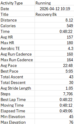
If you are looking on a effective and easy to follow tutorial on some ways to display Garmin data into excel you are in the right place. I have undergone the hardships, fought through trial and error, experimented and found the best way to make charts for your data in excel. Bubble Charts effectively summarize and compare pieces of Garmin data which I will have separate tutorials for down below!
Before starting any tutorial, ensure you have a Garmin watch which is linked to a Garmin Connect account. I used the “Forerunner 235″ however any watch will work for these tutorials. On your Garmin or Garmin connect make sure you have gone to display settings and selected your desired units which for me was the Metric system, this prevents you from having to do conversions manually later on. Also in your Garmin settings, enter your proper height, weight, age and gender, this allows for more accurate data. I for one had my stats as a 5’5″ female despite actually being a 6’1” male which was tampering my statistics while I first started trying to make these charts. Once you have completed these steps you are good to start your run, save your data and then export it as a CSV file where you can then open in excel. You can do two of following charts with data from just one run and then the other needs a minimum of 2. Once your data is in excel, hold the keys (Ctrl,-) over the rows labeled “Favorite”, “Decompression”, “Training Stress Score” and “Number of Laps”. We will not use any of those rows in any of the charts and theirs no way of substituting them in for other values therefore removing them just helps remove some noise. Lastly, it is easiest to make charts with the axis flipped between data, all you have to do in order to flip it is copy all the data, open a new sheet, choose the cell A1, click on paste options and choose the option labeled “transpose”. Once you have your data in excel and it looks something like mine below you now have easy to read, relevant statistics from your run and you are good to start any of the tutorials of your choosing!!!
Tutorial 1: Single Run Bubble Summary Chart. To make a Bubble Summary Chart that compares any combo of running data that you want (I will use distance or aerobic TE with average heartrate and pace) use the following steps.
*Before starting, in a empty cell use the function “= (Pace Cell)1400” and replace your pace value with the value of the calculation, Excel treats pace values like a time, this fixes that issue.
1- For Step 1 hold CTRL on your keyboard and select the columns labeled “Distance”, “Avg HR” and “Avg Pace”. Select Insert > Scatter Chart > Bubble. The bubble chart will then appear.
2- After making the chart you will likely have no bubble. To fix this first right click on the vertical axis values and under axis options have your minimum value as your warmup heartrate (zone 1) if you know it, if not use 100, for your VO2 maximum heartrate (zone 5) if not use 190. Do the same for the horizontal axis but for minimum use a pace that you can’t hold for more than a kilometer (I use 3) and for your maximum use a pace which is a minute slower then your conversation pace (I use 7). this will give your graph proper a proper axis.
3- Next right click the graph, select your point, go edit, and make sure that Series X is your avg pace, Series Y is your avg heart rate and series size is your distance. Now your bubble should be visible feel free to keep it the default color or switch it to any color you desire.
4- Time to label the graph, for the title click on the default title, delete it and then click on the cell that has your runs name. Name the bubble “Run Summary”. Label the X and Y axis “Avg Pace (Min/Km)” and “Avg Heart Rate (BPM)” by clicking the plus icon near the top right corner of the graph and adding axis labels. You should now have a graph like mine below.
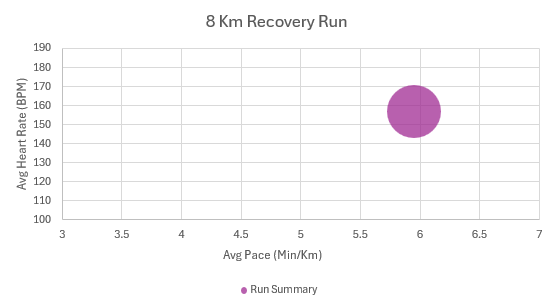
Interpreting your graph- What your graph is showing you is a summary of your run. The size of the bubble represents how long you ran while the y axis represents your heart rate and the x axis your pace. This is useful because you can use it as a way to score your run in what you are trying to accomplish that day. I was trying to do a recovery run, ideally for this my bubble would be lower then it is. If you were measuring a tempo run, you would want the bubble further left and it would likely rise. The size becomes especially useful when comparing multiple runs which I cover further down. You can also replace distance with Aerobic TE which will instead measure the runs intensity which is equally as useful.
Tutorial 2- Bubble Comparative Chart. To make a Bubble Comparison Chart between multiple runs use the following steps. Again you can you any pieces of data you would like to compare but I will be using Average Cadence and Average Stride Length with average Steps to see how my Cadence and Stride Length holds as I put mileage on my legs.
*This tutorial can be done independently to chart 1 but I recommend doing chart 1 first as it helps.
1- Ensure you have data from at least 2 runs in excel. Use the same steps for uploading a single run but with multiple csv files. Now you have multiple runs in which you compare the data of.
2- Hold CTRL on your keyboard and select “Avg Cadence”, “Avg Stride Length” and “Steps” for both runs. Select Insert > Scatter Chart > Bubble. The bubble chart will then appear.
3- For each axis, right click the scale and then select axis options to change the scale. For your Y axis use your previous running data that falls into similar range (if you don’t have data use the automatic values Excel uses) to calculate a 6 point scale for me my range is 1-1.06. For the X axis use the same method to form another 6 point scale but with Cadence (use the automatic values again if you don’t have previous data) for me the range is 155-161.
4- Right click on the graph and click select data. You want to make sure that you have 2 Legend Entries titled under your separate runs. For each run, select the avg cadence level for series X, avg stride length value for series Y and steps for series size. Now your bubbles will appear in there correct places at the proportional size.
5- Now label the graph by selecting the plus symbol and adding axis labels, label the Y axis “Avg Stride Length (m)” and the X axis “Avg Cadence (SPM)”. Then Title your graph “Stride and Cadence between Different Run Lengths”. You should now have a graph similar to mine below.
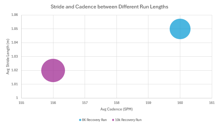
Interpreting your graph- What your graph is showing you is a comparison of two different runs where one you took more steps then the other which is indicated by one bubble being larger then the other. Ideally your bubbles would overlap especially in 2 recovery runs where you’re doing the same type of run however as seen mine don’t meaning with more steps I lost cadence and stride length. These comparison’s are useful as it identifies weak points in your running which gives you room for improvement. For example this shows me that as I increase mileage on my legs I need to work harder on continuing to keep my running form consistent. While I used 2 runs to keep the tutorial simple, you can repeat these steps continuously and compare even more runs which is where Bubble Comparison Charts become the most useful for running.
Moving forward with this info- While the examples I used are useful applications of bubble charts, they are by no means limits in what data can be used and compared by them. Any point of data that we didn’t delete early on can be summarized or compared with other pieces of data in Bubble Charts. Similarly when these tutorials are designed to be runner specific for those who have similar interests as myself, Bubble Charts can be used to compare most data. If you found this helpful I would recommend taking an Excel workshop. If you like me attend UVic the UVic Library offers a very helpful Excel workshop where I learned nearly all the skills that I used to design these tutorials. Knowledge on using Excel is versatile, while this was designed for runners, these skills translate to other fields. I myself am a business student and compared to others in my year, I have a far deeper understanding for Excel and often end up helping my friends on learning Excel for Statistics assignments. So don’t limit yourself to one field with Excel!!!
While these are 2 very quick tutorials, it took my 10 hours of work to produce and even more hours of learning Excel to get here! If you want to see part of my process I would suggest checking out my other blog posts that document my learning process and progress!!! I will also make a summary post very soon that goes more into the process and the many failures I encountered in developing these methods.
Thank you so much for following this process and I hope this info ends up helping at least one person in the future!
Leave a Reply